
Project Overview: Refining the Experience of Hey Penny
Client: Hey Penny
Role: UX Specialist – PM Hybrid
Timeline: Ongoing (2024–present)
Focus: Improve onboarding flow, reduce cognitive overload, and build trust.
Context: Identifying User Friction and Trust Gaps
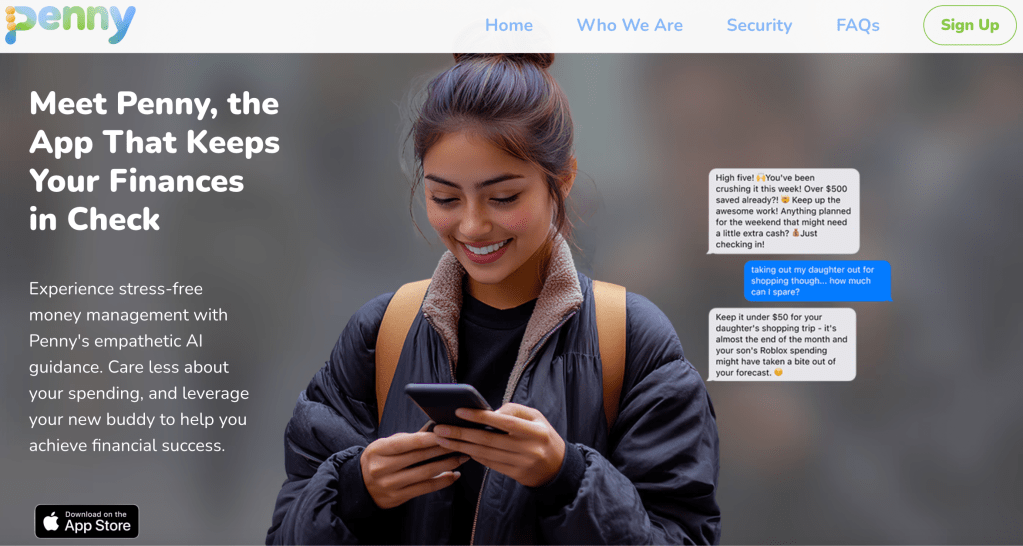
Hey Penny is a financial wellness app designed to help people in their 20s and 30s manage their finances with smart automation and clean, intuitive visual design. The app allows users to set goals, link their accounts, and track their financial health in one place. However, early data indicated two significant issues that were hindering user adoption:
- Trust Gaps: Users felt uncertain about entering sensitive financial data due to concerns about security and clarity.
- Cognitive Overload: The sheer volume of information presented in the app led to overwhelm and confusion.
The client brought me in to evaluate key user flows, run competitive and heuristic analyses, and provide clear recommendations to help the design team refine the experience — particularly around the onboarding process and dashboard layout.
Note: This is an ongoing project. Any information related to the product roadmap or future features is confidential and excluded from this case study. The artifacts and strategies below focus solely on public-facing heuristics, design explorations, and research insights.
My Role: UX Specialist – PM Hybrid
As a UX Specialist – PM Hybrid, my role involved a mix of research, design exploration, and project management. I collaborated closely with the team to:
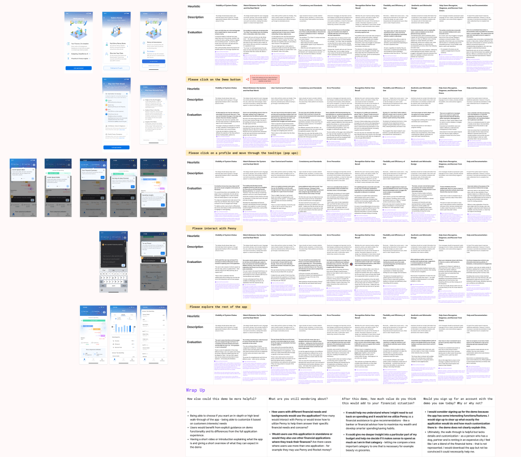
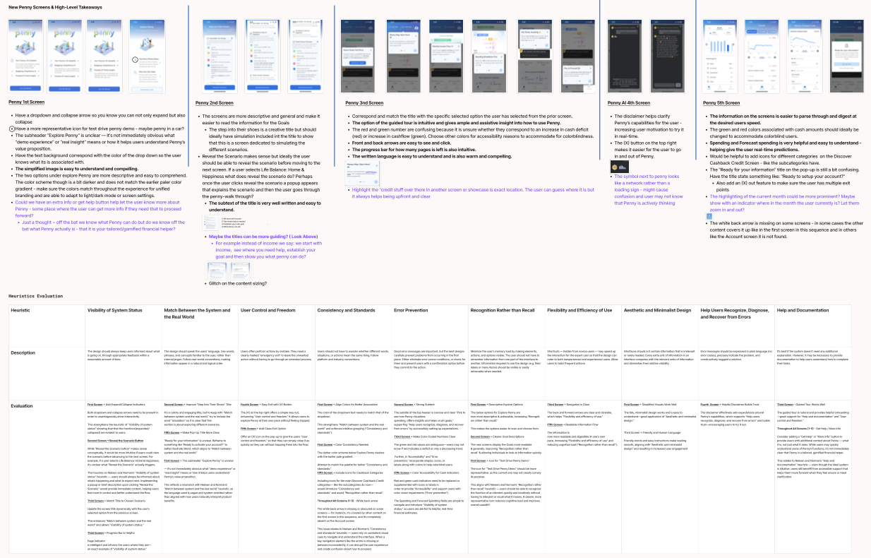
- Conduct heuristic evaluations and user interviews to identify pain points and gather insights.
- Provide recommendations for information architecture and visual design changes.
- Collaborate with the team to prioritize improvements based on user feedback and feasibility.
Key Insights: Trust and Cognitive Load
The primary challenge we faced was designing a flow that felt trustworthy and simple for users, especially when managing sensitive financial information.
These key insights were pulled directly from heuristic evaluations and user interviews, where we focused on understanding user behavior and pain points. From the research, we identified key user needs:
- Clear, Reassuring Visuals: Users needed to feel confident in the security of their data.
- Simplified Information: The volume of information on the dashboard was overwhelming, and users needed a more digestible layout.
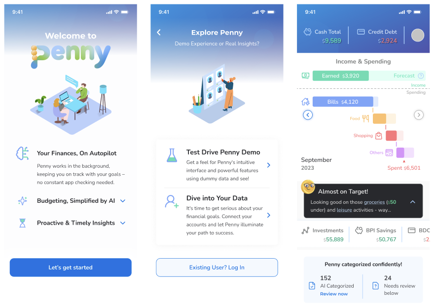
We also discovered that the onboarding process was a major pain point — users often abandoned it because the steps felt too complex or unclear.
Design Exploration: High-Contrast Colors and Simplified Layout
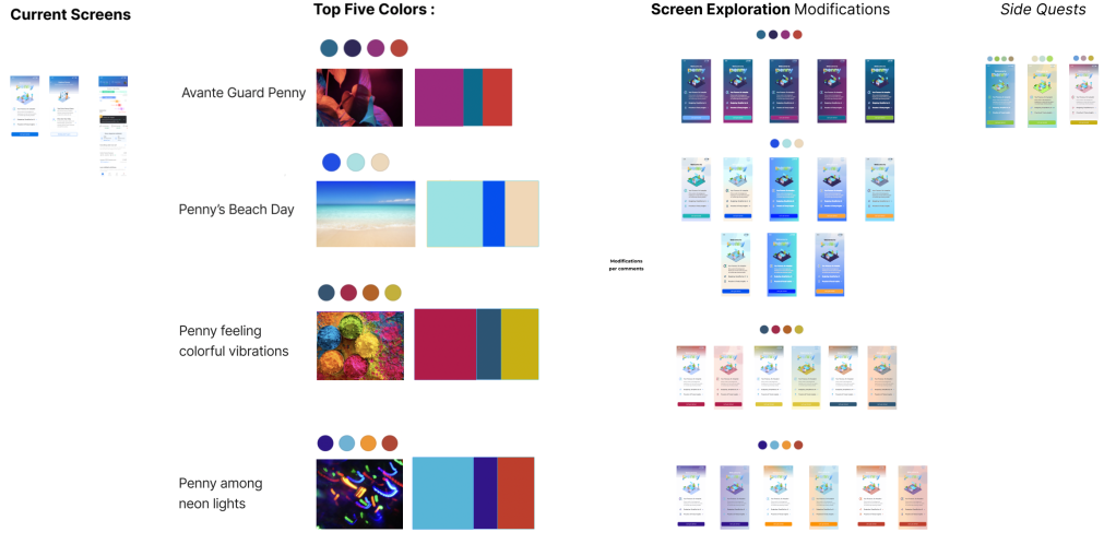
Our first step in tackling these issues was to explore bold, high-contrast color schemes that could immediately grab attention and communicate trust. By adjusting the color palette, we aimed to:
- Improve visual hierarchy so users could focus on key actions.
- Convey a sense of security and clarity.
At the same time, we reworked the information architecture to simplify the dashboard layout, reducing cognitive overload. This involved:
- Consolidating key information into easily scannable sections.
- Prioritizing important features and reducing unnecessary clutter.
Competitive Analysis: Learning from Other Financial Apps
To further guide our design decisions, we analyzed competitor apps in the financial wellness space. We paid close attention to their user funnels and how they structured their onboarding and in-app flows. Through this, we were able to:
- Identify best practices for introducing new users to the app.
- Understand which design elements contributed to higher user trust and engagement.
- Evaluate how competitors presented security features to alleviate user concerns.
User Research: Prioritizing Pain Points
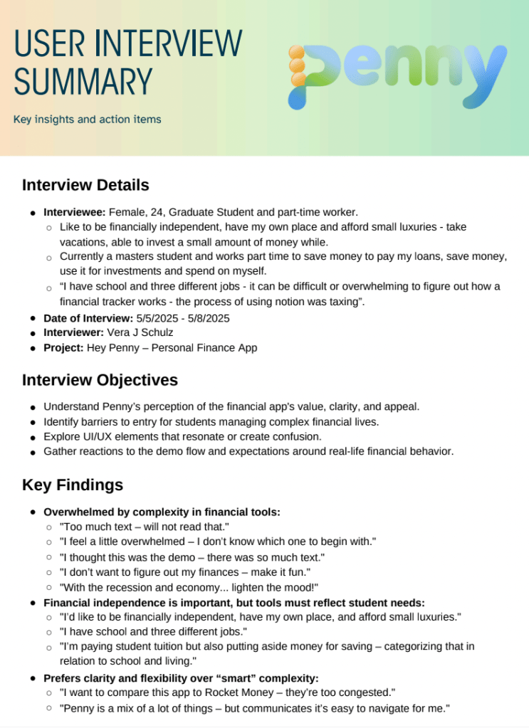
Based on 4 initial qualitative user interviews, we also started to prioritize improvements, focusing on those with the greatest impact. The process involved:
- Identifying features that would most likely address the trust gaps and cognitive overload.
- Using feasibility and impact assessments to determine which changes should be tackled first.
High-level Recommendations included:
- Improving onboarding to be quicker and more intuitive.
- Introducing new visual cues to convey trust and simplicity.
- Restructuring content on the dashboard to help users focus on their goals without being overwhelmed by too much data.
Ongoing Work: Refining and Testing
This is an ongoing project, and we’re continuously gathering feedback through A/B testing and user observations. Moving forward, we plan to:
- Conduct further user testing to refine the onboarding process.
- Explore more granular color and typography choices to further enhance user confidence.
- Continue simplifying the app’s information architecture to make financial data more digestible.
Note: Since this is an ongoing project, any confidential details about future features, the product roadmap, or internal strategies are not included in this case study.
Reflection: The Value of a Hybrid Role
This project shows how a hybrid UX/PM role can drive both design and strategic decision-making. By conducting in-depth user research and competitive analysis, I was able to make informed recommendations that will continue to evolve as the project progresses. It’s an exciting challenge to work on an ongoing project where real-time feedback is shaping the direction of the app.
